Overview a brief walkthrough through the core UI elements.
Because the a7EBusiness platform is a dedicated Windows app, the user interface is made to feel familiar for windows and office users.
The user interface is composed from lousely coupled components which can be freely arranged based on configuration and client needs.
Thanks to the usage of the WPF technology, it's possible to style the user interface freely, to make the look'n'feel user friendly.
Navigation
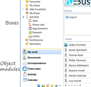
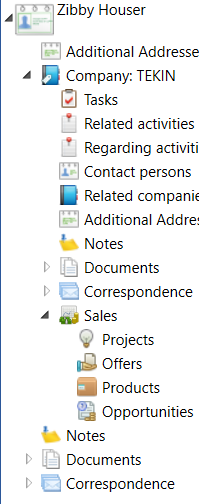
The main navigation through the system is done with the help of the system explorer which makes it possible to navigate through the system with the help of boxes and object modules
Boxes are used to group certain functionalities. Mostly by containing objects of certain type (entity). For example the Companies box will display objects of the company entity. Additionally a box can contain a filter so that it displays only objects which fulfill the filter, like e.g. the Competitors box will display only companies that are classified as a competitor. Boxes can also be associated with more entities, e.g. the Activities box displays all entities that are classified as activities, so tasks, phone calls, meetings etc. Last but not least boxes can be independent from entities and display own custom workspaces, like e.g. the Security box displays a security desktop.
Object modules are simply modules which groups boxes together by their functionality to make the navigation through the system easier. E.g. the Documents object module will group the Documents, Folders, Contracts, Letters etc. boxes.
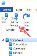
Boxes
We have following types of boxes in the system:
- Data boxes - displays a given object type (entity), optionally with a filter. Mostly when clicked displays a list of records.
- Detail box - displays a single object. When clicked displays the detail view of the object
- Grouping box - doesn't display anything itself, the purpose of this box is to group other boxes
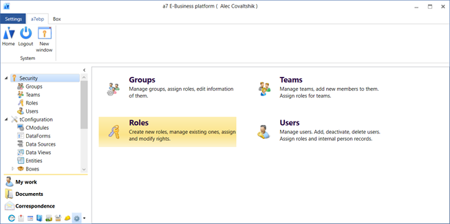
- Desktop box - isn't associated with certain entities per se, when clicked displayes a configured desktop/dashboard. Like the start screen, the security dashboard etc.
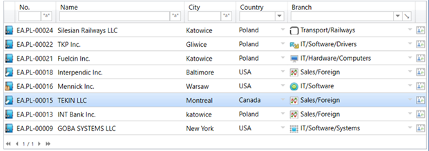
Table View
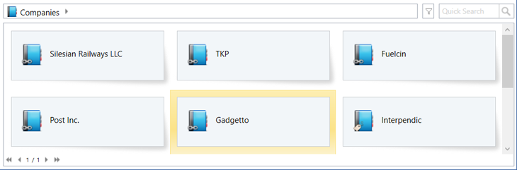
Cards View
The cards view is especially usefull for boxes that display objects of different types (entities) that don't have common fields that could be displayed in a tabular fashion.
However it's still possible to display even standard data boxes using the cards view, it's a user setting so that the user can decide how he want to view the data. Some objects can have totally dedicated custom views.
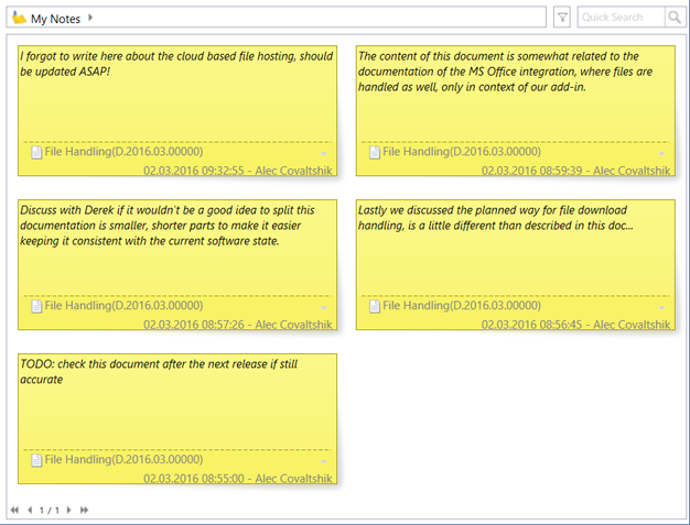
Custom Views
It's possible for entities to configure dedicated custom views, based on the requirements of the given entity.
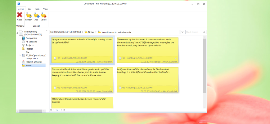
For example the notes entity uses a custom cards view for a nicer UI
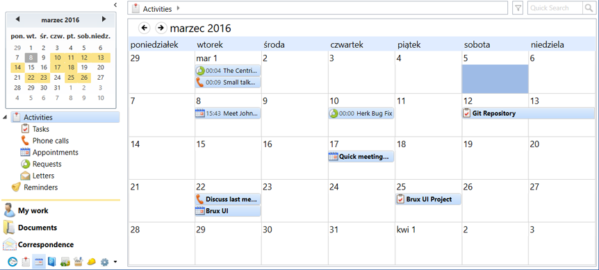
Another good example of a custom view is the calendar which can be applied to any entity where it makes sense. That is, where the entity contains a date field which can be used to configure the view, so that the objects can be displayed on the calendar accordingly

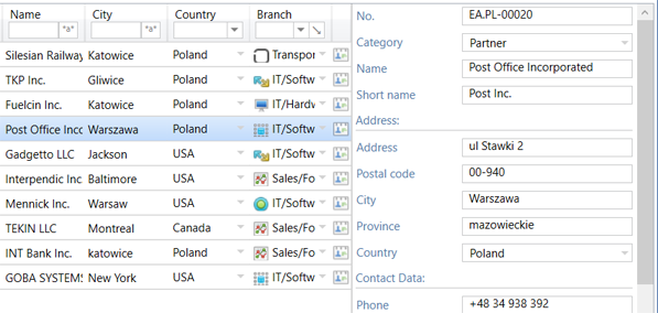
Object preview
In the table view it's possible to enable the object preview, which allow to have a glance of the selected object without opening it's detail view.
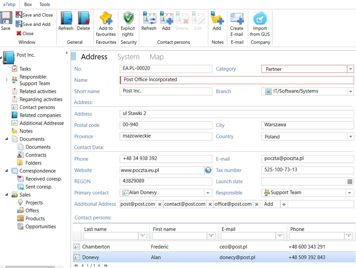
Detail View
The detail view is for standard objects the central place to work on a single object like a document or company. It shows all the associated objects through the relation tree, and all the data of the object itself on the view. Functions specific for the object are available through the ribbon bar.
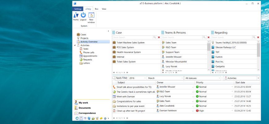
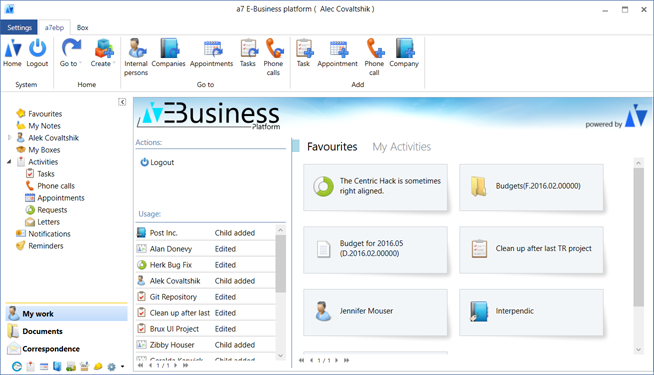
Desktops and dashboards
Desktops and dashboards can contain any UI elements implemted in them. They can contain various charts, summaries, reports, live data, system shortcuts etc.
DataPicker
The datapicker is an UI element which purpose is to allow the user to find an object in the system in a fast and efficient manner.
We use the datapicker control mainly in two places:
- In the column and advanced filter, if we want to filter based on a field which is pointing to another object. E.g. the responsible field in the document or task object pointing to a internal person entity.
- In dataforms of objects - to associate the edited or create object with another object. E.g. like above, if we wan't to set a person as responsible of a document or task.
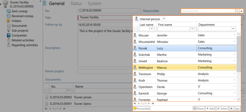
As we can see on the screen shot, on small space from the context of the parent object the user is able to find an object using the known quick search and column filter functionalities, as well select an object from his favourites. It's also possible to quickly add a new object of the given type (in this case - an internal person) or to view details of any object from within the datapicker.
Relation Bar
In many places of the system, above the workspace the relation bar is displayed. It's role is similar to the of breadcrumb above a file explorer.
It shows the context of the current displayed and/or selected object, and the available related objects of it.
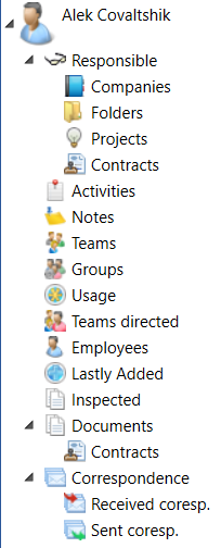
Relation Tree
On the detail view of an object on the left side the relation tree is visible. The purpose of this element is to provide a overview of all related data of the displayed object.
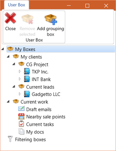
My Boxes
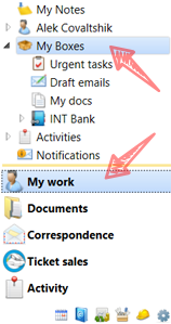
- Simple list of objects like documents. So that's accessible from the initial module.
- Filtered list of object, e.g. tasks which are owned by the user.
- Related list of objects, e.g. email messages from a contact.
- Detail view of a object, e.g. of a project, with fast access to all related items of that project, tasks, appointments etc.